Commemorative Coins of the United States
Q. David Bowers
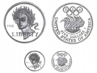
1988-W Olympic $5 Gold Coin
Another $5 Commemorative Issue
The holding of the 1988 Summer Olympic Games in Seoul, Republic of (South) Korea furnished the opportunity for the issuance of commemorative silver dollars and $5 gold coins under Public Law 100-141 approved on October 28, 1987. (Refer to commentary under the 1988 Olympic silver dollars for additional information.)
Selecting the Designs
Designs for the two coin denominations were solicited from 10 private sculptors and seven on the Mint staff. The Commission of Fine Arts made selections from 60 outside and 24 Mint designs submitted. Each entry was marked with a code letter and number to conceal the identity of the artist. The Commission recommended obverse sketch J-1 and reverse sketch D-4. Secretary of the Treasury James A. Baker III agreed with J-1, the head of Nike or Liberty by Elizabeth Jones, and selected it, but D-4 was rejected, and in its place L-4, by Marcel Jovine, was picked. (Minutes of the Commission meeting, January 21, 1988, p. 2.)
An official Mint news release described the designs: "The gold coin was designed by Elizabeth Jones, chief sculptress and engraver of the U.S. Mint. The obverse features Nike, goddess of Victory, and a wreath of olive leaves. The reverse features Marcel Jovine's stylized Olympic flame, evoking the spectacle of the games and the renewal of the Olympic spirit every four years." On March 2, 1988, the Treasury Department announced a slight modification of the design: "On the reverse of the gold coin, USA has been added to the Olympic rings."
Numismatic columnist Ed Reiter viewed the designs and commented as follows: ("Judging the Judges," COINage, April 1988, p. 20.) "Elizabeth Jones deserves the highest acclaim for her lovely Nike portrait ...Jovine's reverse is functional and clean .......The most obvious problem this time is the clash in artistic styles between the two sides of the coin. Ms. Jones's classical obverse never should have been mated with Jovine's modernistic reverse. Each is a fine design it its own right, but putting the two together is like welding the front of a dignified Rolls-Royce to the back of a snazzy Corvette. Aesthetically, the marriage is a bad one .... " (Marcel Jovine, who designed the reverse, agreed, stating: "I am sort of annoyed about this split-about having two different artists on the front and back. It causes a real loss of artistic integrity. It's like I'm closing the paragraph of somebody else's phrase" (as quoted by Ed Reiter in "They Created the Designs, COINage, April 1988, p. 70).
In an interview with the present author, Mint Director Donna Pope suggested that the problem of different artists working on the same coin was not major: (Interview with Q. David Bowers, February 11, 1991.) "Every once in a while someone will say the obverse of a coin design doesn't match the reverse. There have been times when there were raised areas the same place on the obverse and reverse that have caused production problems at the Mint when the coins were struck. Aside from that there have not been problems. I cannot remember ever having an average guy on the street complain about the front not matching the back of a coin."
Elizabeth Jones and the Obverse Design
As quoted in Coin World, ("Chief Engraver Strives for 'Sculptural Effect," by Richard Giedroyc, February 28, 1990, p. 16. Excerpt from a talk given by Ms. Jones to the assembled members of the Society for U.S. Commemorative Coins.) the chief engraver told how she chose the obverse design: "Jones described her 1988 gold Olympic coin as 'a mixture of Liberty and Victory. Liberty goes perfectly with the Olympics because the Olympics symbolizes liberty,' she said. 'I thought, I'm not going to choose a sport [for a design subject].' Jones continued, 'I tried to give her a sense of dreaming and yet a forceful chin.' Jones said she believed she could have done better without the time restraints given her to design this coin. She did not enter the competition for the Congress [Bicentennial] commemorative coin program design because of very short deadlines imposed for that contest."
I had the privilege of visiting Ms. Jones in her office at the Mint during the creation of the obverse motif and noted with interest the several sketches and models she had made of variant designs before deciding upon the one finally adopted. (The Engraving Department at the Philadelphia Mint is located in two rooms, one on the left being for the general department and containing work spaces for several sculptor-engravers, and one on the right being that of the chief engraver. Over the years the writer has visited the Engraving Department a half dozen or more times through arrangements made by the director of the Mint.) The motif was widely acclaimed for its beauty, with Coin World editor Beth Deisher paying this tribute. (Issue of June 15, 1988, p. 4.) "Jones's head of Nike design in our opinion is one of the most beautiful of all U.S. coin designs. It rivals her 1986 Statue of Liberty design, which at the time we had ranked among the greats of all time. Yes, right along with Augustus Saint Gaudens' design for the 1907 [MCMVII] double eagle. Apparently many people around the globe agreed with us because Jones's Statue of Liberty design was recently selected Coin of the Year for 1986 by an international panel of experts."
At the same time trouble was brewing. GreyCom, the advertising agency hired to promote sales of the 1988 Olympic coins, wanted to rush into print to encourage business; and in the absence of having an actual photograph of the 1988-W $5 gold coin (for it wasn't ready yet) the agency used a computerized representation of the Jones motif embossed on various sales literature. "U.S. Mint Chief Engraver-Sculptor Elizabeth Jones is hopping mad. And. she has a right to be," Coin World reported.(June 15, 1988, p. 4. Part of the editorial quoted earlier.) "The computer-enhanced artist's rendering ...is a gross artistic miscarriage." The editor of Coin World went on to describe GreyCom's unfortunate depiction as "ugly" and not even good enough for a counterfeit!